Case Study: shaRe Visualization Project

View Demo
share Visualization screenshot share Visualization mobile screenshot

Overview

shaRe was a conceptual SaaS platform intended to visualize complex organizational structures rooted in modern theories like "Aligned Autonomy," the "Dual Operating System," and "Org Physics." The product aimed to present dynamic, networked relationships within companies through custom-built visualizations, bridging the gap between abstract theory and observable application.

The Challenge

There was no existing prototype, design system, or clearly defined user journey. shaRe existed primarily as a philosophy with loosely defined use cases, lacking a concrete, marketable product. My job was to bring the vision to life through tangible visual storytelling, using whatever design and development technologies I wanted, as part of an exploratory consulting engagement.

Adding to the complexity was the founder's strong conceptual leanings, which were often delivered through dense slides filled with abstract organizational logic, unpolished visuals, and scattered metaphors. This project served as a kind of informal "test" to see if I could interpret not only the visual content, but also the philosophy behind it — and translate it into something cohesive, scalable, and user-centric.

On a personal note, this project was unique in that I was provided virtually zero context or guidance on how to navigate the expectations. It was entirely interpretive, with no roadmap or brief to reference. Everything I created stemmed from my ability to absorb conceptual theories, interpret sparse and often contradictory feedback, and build a visual system that could theoretically support a future product. This was one of the most unusual and creatively demanding case studies of my career.

Original slides

The Goals

  • Visualize the underlying ideas behind shaRe in a compelling, interactive way.
  • Develop front-end proof-of-concept components for organizational diagrams.
  • Explore different visual metaphors for networked vs hierarchical structures.
  • Support brand storytelling efforts by aligning visuals with website development.
  • Develop the product to be used as a key highlight demo for Fortune 500 enterprise pitches.

The Process

  • Participated in exploratory sessions with the founder and senior leadership.
  • Researched theoretical frameworks provided, including Aligned Autonomy and Org Physics.
  • Interpreted the founder's conceptual diagrams and transformed them into visually digestible, interactive mockups.
  • Created a new design language that was visually striking, engaging and had an almost futuristic aesthetic.
  • Coordinated with stakeholders to refine visuals in line with the evolving (and often ambiguous) product narrative.

The challenge of course, was trying to make something visually engaging and a little more polished and professional than the initial Google Slides presented to me. The initial concept started off as a simple slide show, but quickly evolved into an interactive tool that would engage users and help anyone better understand the theory behind all of this.

The First Prototype

The first prototype was a 'clickable' slideshow that allowed the user to progress from one slide to then next. I incorporated a fade effect in order to transition one slide into another. Below each slide could sit a simple caption and the scalability made it possible to keep adding slides.

While this worked, there was some user experience challenges:

  • No icons or buttons, essentially the navigation to move forward was invisible
  • Descriptions were short and context was missing for the user
  • Lacked any kind of cohesive branding or visual design language

Designing a Cohesive Language

Having specific images fade one into the other helped to animate this visualization project. I created identical frames in Figma which could be layered on top of each other in the final product. This would allow for a seemless transition between certain images where context could be placed. No 'jankiness' between images.

UX Experimentation & Design

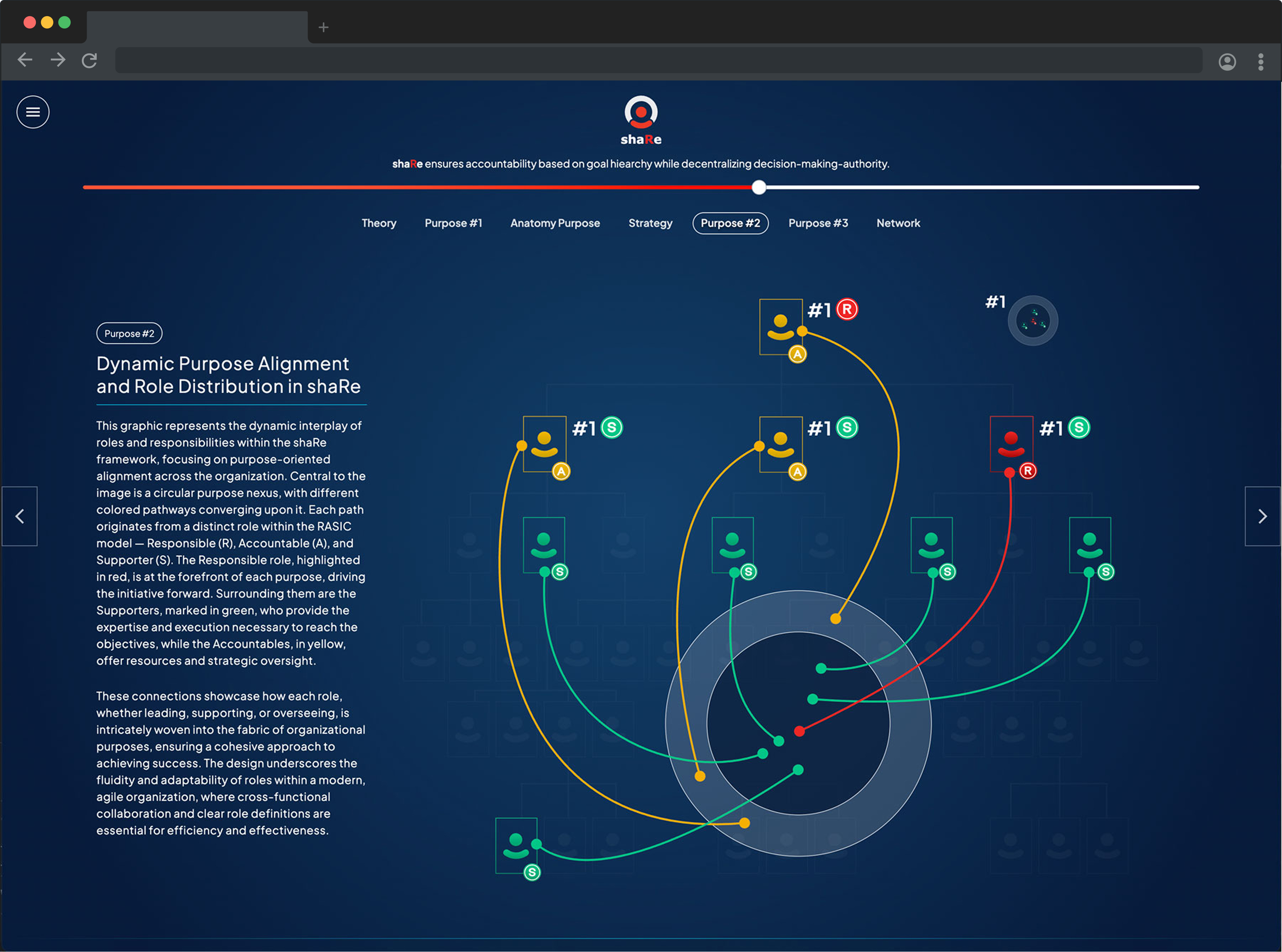
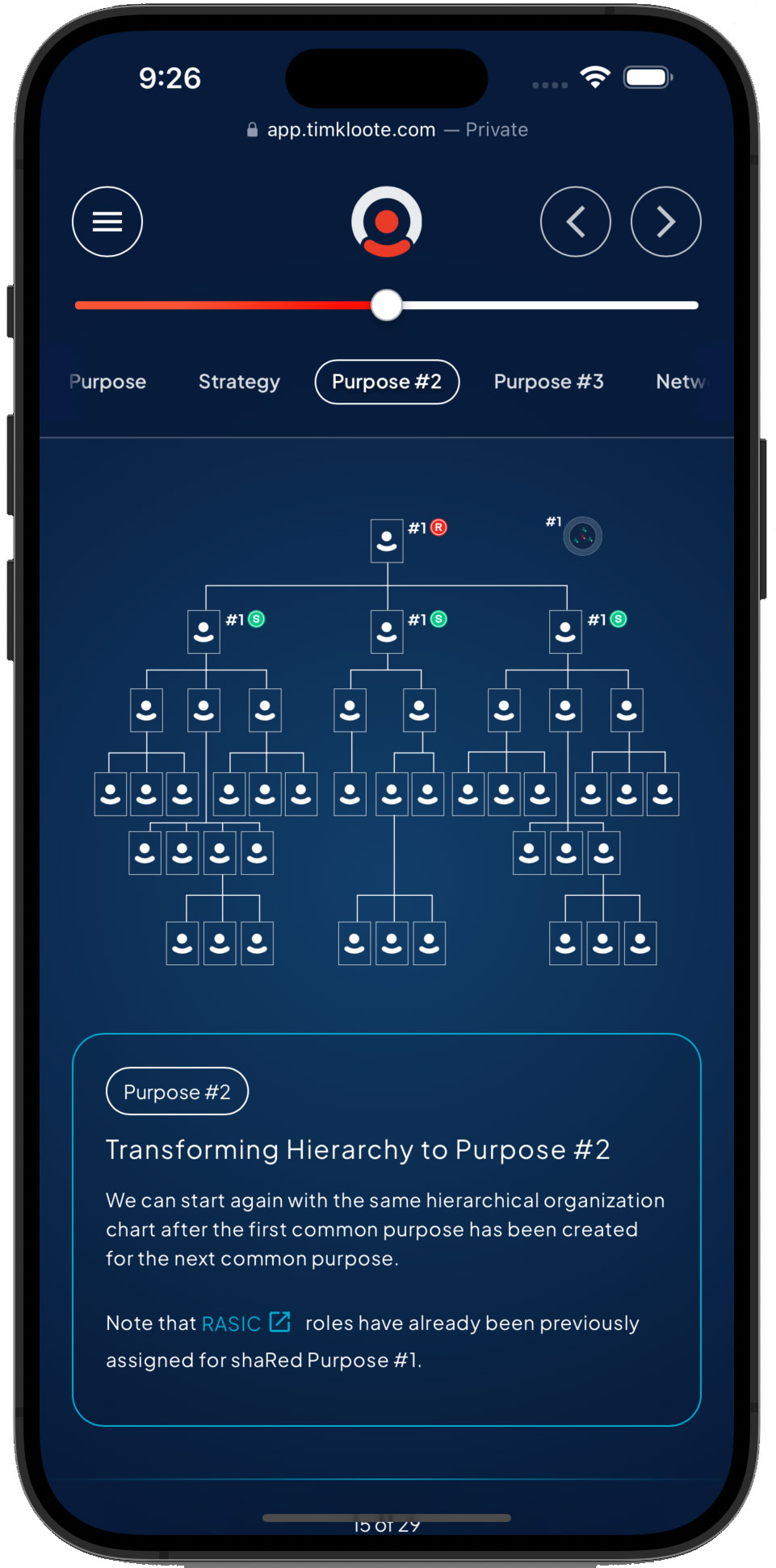
Because I had a little more creative freedom with this project, I got to push the boundries of user interface and user experience. Simple controls weren't enough to satisfy the end users. I wanted to create something that allowed the users to navigate freely throughout the experience in multiple ways.

  • Traditional previous and next buttons moving between slides one at a time.
  • Using the input range slider as a scrubber & progress bar to visually show the user where they are in the context of the project.
  • Having a menu that opens up to a visual film strip of slides allowing the user to visually move between slides / pages.
  • Tagging each slide with a specific category to show the context of where it appears within.

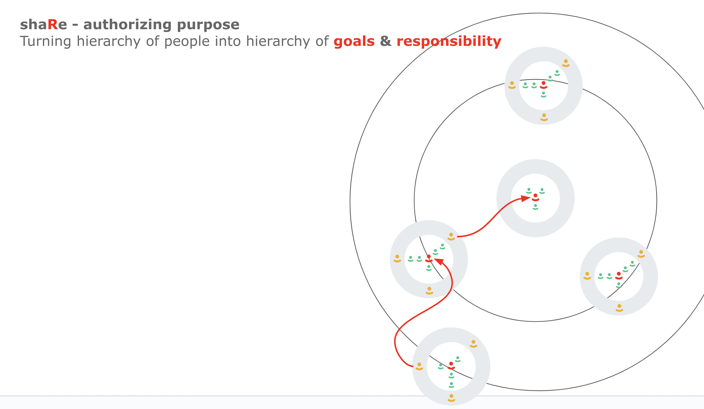
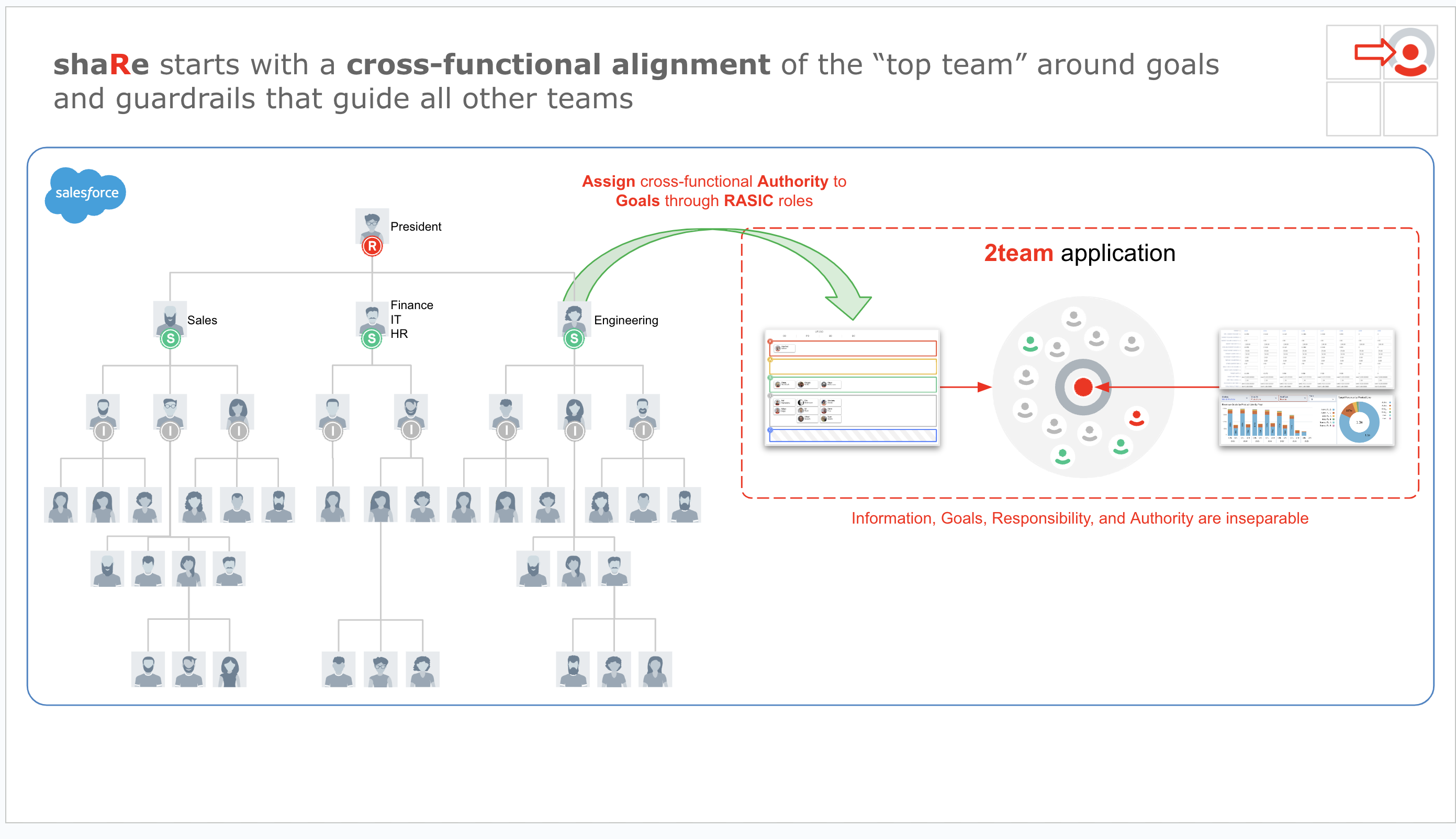
The inspiration was largely from futuristic interface design I had researched. Dark backgrounds with a stark contrast of white or light text. Same with the images, having white outlines with colors that easily stand against a dark background. I wanted it to be visually striking, almost 'sci-fi' looking in a way. I took advantage of the creative freedom I had with this project to do something a little 'outside of the box' while still adhering to UX/UI practices.

Mobile Considerations

Scaling back these images on mobile is a challenge because of screen real estate. Previous and next controls were moved to the top, the images were placed front and center and descriptions were moved underneath. The hamburger menu works great on mobile since the users can navigate visually like a film strip to get to where they want faster. The category tags were also set up to scroll on click, a user can horizontally scroll left / right to show all of the category tags and tapping on one will center align that specific tab on screen giving context to the previous / next tabs.

The Outcome

  • Delivered multiple visual prototypes that translated shaRe’s abstract organizational ideas into engaging, visual form.
  • Developed modular front-end components for future product use.
  • Provided strategic feedback on the UI/UX feasibility of integrating these visualizations into a product roadmap.
  • Helped the company better define the visual identity and potential application of its theoretical foundations.

The stakeholders, which included the entire leadership team at Up2Go, were visually blown away by this project. It was above and beyond anything they could have imagined because it went well beyond anything they thought possible. Taking theory and turn it into something that was visually striking, appealing and engaging to anyone.

"I’ve never seen anyone decode abstract organizational theory and turn it into a functional visual prototype the way Tim did. What he delivered exceeded all expectations — honestly, I didn’t think anyone could interpret what I was trying to communicate, but he made it REAL.

Tim’s work brought a level of clarity and structure to shaRe that allowed us to see the potential of our concept in a completely new light. His ability to work independently, absorb complex ideas, and deliver thoughtful, polished design solutions made him an invaluable part of the project.

This visualization wasn’t just an internal exercise — it was developed as a foundational asset to present shaRe to potential enterprise clients like Bosch and Bayer, as well as future investors and partners. Tim’s work elevated the credibility of our platform and played a key role in shaping how we communicated shaRe’s value to Fortune 500 audiences." Manfred Schon, Founder of Up2Go

My Reflection

This project required navigating extreme ambiguity while balancing theoretical frameworks with real-world design decisions. It demanded strong visual thinking, deep patience, and the ability to deliver high-quality work without a clearly defined product spec. Despite the lack of a launch-ready outcome, this engagement showcased my ability to lead from vision to execution under unclear conditions.