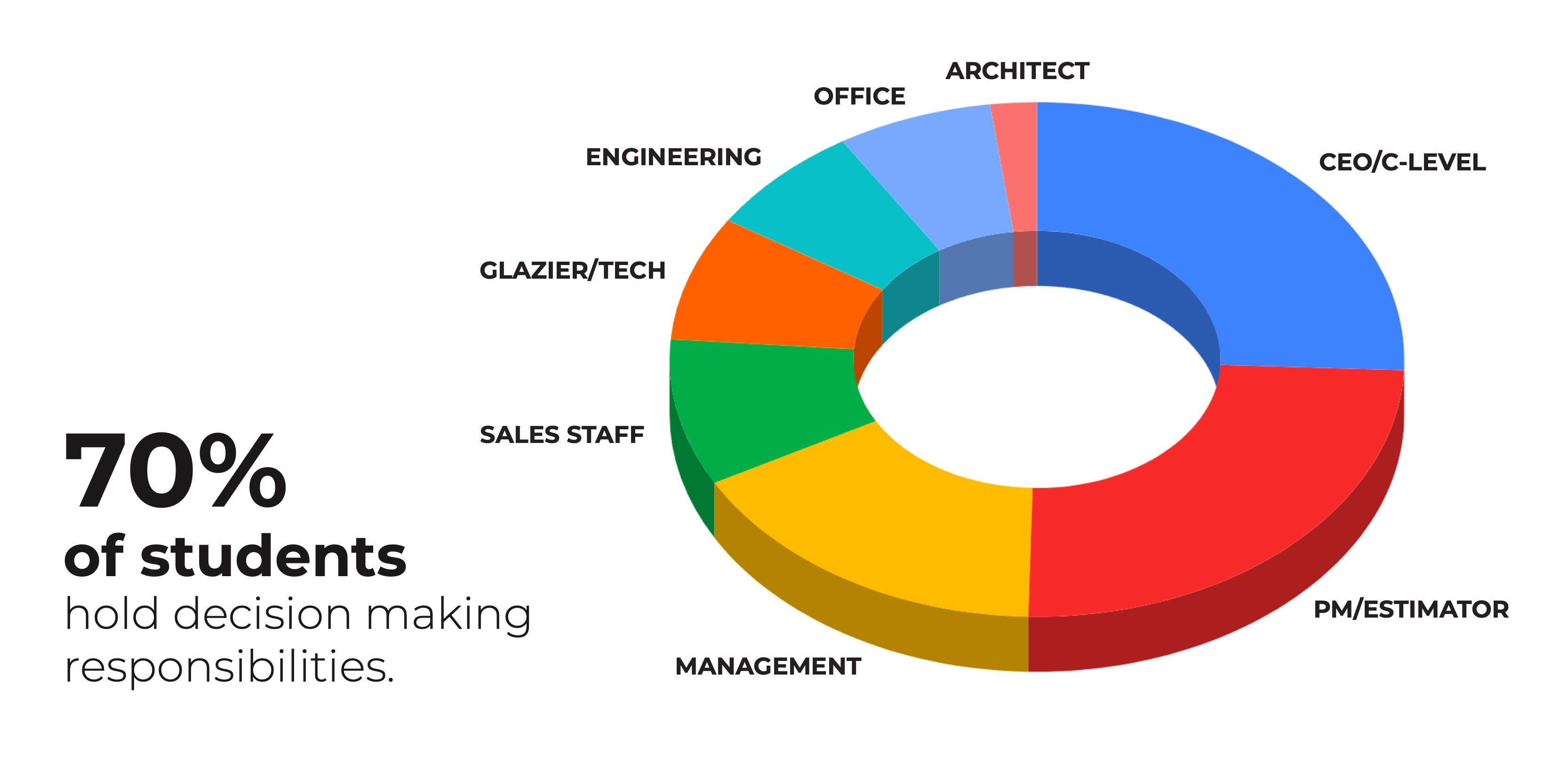
Case Study: LearnGlazing

View Platform
LearnGlazing screenshot LearnGlazing mobile screenshot

Overview

LearnGlazing.com is an online educational platform dedicated to the glazing industry — a niche, technical field focused on commercial glass installation. The platform provides structured video training, evaluations, and downloadable resources for professionals ranging from entry-level glaziers to senior estimators and architects.

I was brought in to lead a complete overhaul of the site’s visual design, user experience, and overall presentation. As someone with a background in architectural design, this project felt like a return to my roots — blending design, logic, and structure. It was a full-spectrum challenge that stretched me creatively and technically across design and development, from ideation through launch.

The Challenge

Before I joined, LearnGlazing.com was built on a generic WordPress theme with no distinct brand identity or design system. The site felt visually dated, content was difficult to access, and the course structure lacked clarity. Major issues included:

  • A cluttered homepage with no clear hierarchy or messaging
  • A poorly formatted pricing page with inconsistent visuals
  • A linear, unsearchable course structure that overwhelmed users
  • No ability to filter, tag, or explore relevant content based on skill or role
  • An outdated look-and-feel that failed to connect with high-level professionals

Additionally, the platform needed to differentiate itself from major eLearning giants while still offering a polished, intuitive, and professional experience.

Research & Discovery

I conducted a research phase involving user surveys, stakeholder interviews, and analytics review. We identified clear trends:

  • 65% of users struggled to find the right course content
  • 70% felt the design was outdated or unappealing
  • 40% found the course map confusing

We also defined key user personas — decision-makers, project managers, mid-management professionals — all seeking quality, on-demand training they could trust.

Stategy & Design Goals

My objective was to rebuild LearnGlazing from the ground up — visually and structurally. Core goals included:

  • Creating a strong, recognizable brand identity with new color palettes, fonts, and patterns
  • Designing a modern, professional experience tailored to educated professionals in the glazing industry
  • Making training content easy to browse, filter, and access
  • Introducing motion and visual storytelling to create a more engaging platform
  • Ensuring responsive functionality across mobile and desktop

Design & Execution

Home Page

Instead of selecting one hero image, I implemented a rotating image system with over 50 high-resolution architectural photos that load randomly — giving the homepage a fresh feel every visit, without any manual intervention.

Course Explorer

The training library was overhauled using animated cards with at-a-glance info, visual filtering, and improved UX. Horizontal scrolling challenges were later solved via user testing and onboarding enhancements.

Pricing Page

We replaced the rigid 3-column layout with row-based pricing tiers — offering clarity, scalability, and flexibility for future pricing models. Hover and fade animations added polish and interactivity.

The Process

  • Participated in exploratory sessions with the founder and senior leadership.
  • Researched theoretical frameworks provided, including Aligned Autonomy and Org Physics.
  • Interpreted the founder's conceptual diagrams and transformed them into visually digestible, interactive mockups.
  • Created a new design language that was visually striking, engaging and had an almost futuristic aesthetic.
  • Coordinated with stakeholders to refine visuals in line with the evolving (and often ambiguous) product narrative.

The challenge of course, was trying to make something visually engaging and a little more polished and professional than the initial Google Slides presented to me. The initial concept started off as a simple slide show, but quickly evolved into an interactive tool that would engage users and help anyone better understand the theory behind all of this.

The First Prototype

The first prototype was a 'clickable' slideshow that allowed the user to progress from one slide to then next. I incorporated a fade effect in order to transition one slide into another. Below each slide could sit a simple caption and the scalability made it possible to keep adding slides.

While this worked, there was some user experience challenges:

  • No icons or buttons, essentially the navigation to move forward was invisible
  • Descriptions were short and context was missing for the user
  • Lacked any kind of cohesive branding or visual design language

Designing a Cohesive Language

Having specific images fade one into the other helped to animate this visualization project. I created identical frames in Figma which could be layered on top of each other in the final product. This would allow for a seemless transition between certain images where context could be placed. No 'jankiness' between images.

UX Experimentation & Design

Because I had a little more creative freedom with this project, I got to push the boundries of user interface and user experience. Simple controls weren't enough to satisfy the end users. I wanted to create something that allowed the users to navigate freely throughout the experience in multiple ways.

  • Traditional previous and next buttons moving between slides one at a time.
  • Using the input range slider as a scrubber & progress bar to visually show the user where they are in the context of the project.
  • Having a menu that opens up to a visual film strip of slides allowing the user to visually move between slides / pages.
  • Tagging each slide with a specific category to show the context of where it appears within.

The inspiration was largely from futuristic interface design I had researched. Dark backgrounds with a stark contrast of white or light text. Same with the images, having white outlines with colors that easily stand against a dark background. I wanted it to be visually striking, almost 'sci-fi' looking in a way. I took advantage of the creative freedom I had with this project to do something a little 'outside of the box' while still adhering to UX/UI practices.

Mobile Considerations

Scaling back these images on mobile is a challenge because of screen real estate. Previous and next controls were moved to the top, the images were placed front and center and descriptions were moved underneath. The hamburger menu works great on mobile since the users can navigate visually like a film strip to get to where they want faster. The category tags were also set up to scroll on click, a user can horizontally scroll left / right to show all of the category tags and tapping on one will center align that specific tab on screen giving context to the previous / next tabs.

The Outcome

  • Site grew to 20,000+ active users.
  • Officially recommended by industry associations like NACC (North Amercian Construction Industry) and AMGT
  • Strong user feedback citing improved usability, structure, and overall experience
  • Created a scalable framework for future training, exams, and tiered packages
Tim was instrumental in the complete overhaul of LearnGlazing.com. He brought fresh design thinking, deep development knowledge, and a true understanding of how to improve user engagement. The finished product elevated our brand tremendously. He didn’t just make it look good — he made it work better. Our users noticed immediately, and we’ve since seen a significant uptick in engagement and overall site performance. Tim has an incredible eye for both UI and UX, and he’s a rare hybrid — a creative who can actually build what he envisions. Chris Martin - Sales and Marketing, Co-owner of LearnGlazing
Tim completely transformed how our content is presented. The redesign didn’t just modernize the site — it made everything more intuitive and visually engaging for learners. As someone who appears in many of the videos, I was blown away by how much more professional the overall platform felt after his work. He understands how to elevate content visually without distracting from it. Everything from layout to typography to responsive behavior feels intentional and polished. It’s rare to find someone who can take a vision and fully execute it in both design and code — Tim does both, and he does it exceptionally well. Alex Buechel - Creative Director

My Reflection

Redesigning LearnGlazing.com was a rare opportunity to merge visual creativity, user experience strategy, and technical execution in a single, cohesive project. From the start, I was deeply involved in every layer — from understanding the industry-specific needs of glazing professionals to rethinking how educational content could be structured for better accessibility and engagement.

This project also brought me back to my roots. I studied architecture at Lawrence Tech, and this work reignited that part of me — blending structural clarity, spatial thinking, and visual hierarchy in a digital space. It felt natural to apply that foundation to an industry I already had familiarity with, and it gave the work a strong sense of purpose and authenticity.

This wasn’t just about making the site look better — it was about making it work harder for its audience. I focused on clean, modern design systems, improved navigation flows, and responsive builds that held up across devices. One of the biggest challenges was reworking a content-heavy platform into something that felt light, intuitive, and brand-consistent — all while preserving the tone and educational intent of the original vision.

Working closely with stakeholders like Chris and Alex, I was able to move seamlessly between creative direction and hands-on development. The result was a dramatic leap forward in both usability and visual polish — and a site that now feels like a true reflection of the value LearnGlazing brings to the industry.